What makes a great convention badge? Design ideas from HLGCon
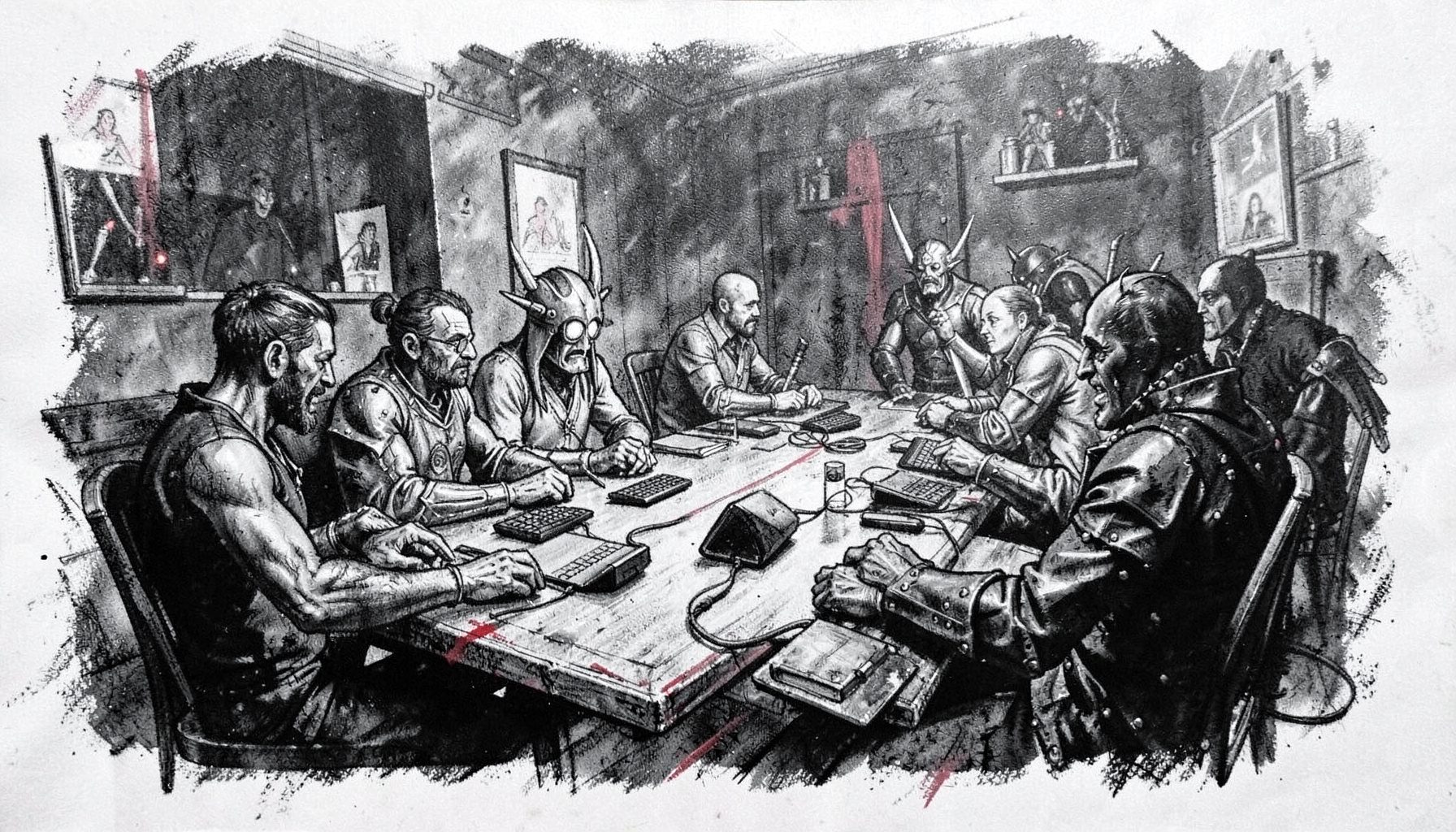
High Level Games Convention (HLGCon) brought tabletop role-players, live-action players, designers, artists, publishers and vendors together at the Showboat Hotel in Atlantic City, New Jersey, in 2018. Its mix of LARP experiences, gaming sessions, panels, workshops, an exhibitor hall and escape rooms showed how many kinds of play can coexist within one community.
A convention badge is often the first piece of event design an attendee encounters. It identifies the wearer, helps staff direct traffic, signals a table or faction, and gives a stranger an easy way to begin a conversation. At a gathering built around collaborative storytelling, that last function matters as much as the practical ones.
Australian events operate in familiar but distinctive settings. Sydney conventions may send attendees between large halls and central stations, Melbourne events often occupy hotels, community spaces and laneway venues, while Brisbane organisers regularly plan for heat around outdoor queues. Local audiences also favour first-name familiarity, making a badge’s display of chosen names and community handles especially relevant.
The strongest brief is therefore both simple and layered: make the wearer recognisable in seconds, respect how they identify, and leave room for play. A badge can guide someone to the right activity while also feeling like a small artefact from the convention rather than a disposable access tag.
Make identity visible and respectful
A badge should introduce the person wearing it, not expose information they have not chosen to share. The largest text can be a first name, nickname, player handle or character name, depending on what feels appropriate at the event. Pronouns may be included when wanted, but they should never be mandatory or presented as an extra burden.
This matters at HLGCon because its culture welcomed different forms of participation. A visitor might arrive as a designer, a vendor, a volunteer, or a participant in an immersive scenario; one format should not visually outrank another. Giving people a choice between their everyday name and a character identity supports the same inclusive participation the convention promoted.
Design the public side for recognition and keep sensitive details elsewhere. Registration records can hold information required for safety or administration, while the badge carries only what helps social interaction. Clear type, strong contrast and restrained colour also help people with low vision or colour-vision differences read the badge without relying on decoration.
Turn visual hierarchy into fast wayfinding
Good hierarchy answers three questions before an attendee reaches a registration desk: Who is this person? What are they here to do? Which part of the venue do they need? Name or character goes first, participant role or faction second, and venue or schedule information third. Everything else should either earn its place or move to a reverse side.
The HLGCon schedule offers a useful reminder that a badge can do more than announce a category of attendee. A convention programme can move between panels, workshops, table sessions and live-action encounters, so a small room, track or activity cue can prevent people from wandering through the wrong spaces. Icons paired with words make this information easier to scan than a string of abbreviations.
Keep the palette and typography disciplined. Two complementary colours, a readable sans serif and no more than one display treatment will usually outperform a crowded composition. Test the artwork in colour, greyscale and at arm’s length, since a badge may be seen across a crowded hall before it is read up close.
Let the badge become part of the story
A useful badge can carry a small narrative hook without turning into a rule sheet. A faction emblem, character title, objective or campaign name may prompt the question that starts a memorable encounter. At HLGCon, where live-action and tabletop play sat alongside creative stalls and escape rooms, that bridge between identities and activities was part of the event’s appeal.
Personalisation works best when it does not exclude people arriving without a prepared character. An optional lore line, community symbol or prompt can complement a plain name badge. The same principle applies to pronouns, colour coding and fantasy styling: visual distinctions should communicate welcome, not create a hierarchy between serious and casual players.
The reverse side can also serve practical storytelling. Exhibitors might use it for a studio mark, a game title, a QR code for a demo or a short commission prompt instead of a dense advertisement. Creators can find useful guidance in selling art at conventions, where display, conversation and artist visibility are treated as parts of the same process. A badge then becomes portable promotion that travels through the event with its owner.
Plan for Australian conditions and budgets
Australian conventions place badges in conditions that can be tougher on paper and people than a short indoor event. In Sydney, attendees may wear badges while navigating rail platforms and long transfers; in Melbourne, changeable weather can affect queues outside hotels and converted laneway spaces; in Brisbane, summer heat and humidity can make lanyards uncomfortable and ink susceptible to damage. The design should survive those journeys, not merely look polished on a desk.
Comfort starts with the attachment. A wider, low-squeeze lanyard, a badge that sits flat, or a secure rotating clip can prevent twisting that hides information. Rounded corners, sturdy card stock and a light protective coating help with handling, while a simple holder can protect a badge from sweat and rain. Before ordering, test the complete badge with the actual strap and a full day of wear.
The local market also shapes what is realistic. Australian tabletop publishers, independent artists, zine makers and local game stores often share audiences with volunteers running community conventions, so an expensive one-off badge may be harder to justify than a small reusable run. Pricing artwork, printing and postage in Australian dollars, sourcing locally and designing a digital or sticker version can keep costs visible to a small organising team. On the reverse, a QR code can direct attendees to an Australian creator’s store, event listing or play group without requiring another printed insert.
A practical badge design checklist
Before approving artwork, check the badge against real event conditions rather than only a large screen mock-up. The following design choices cover identity, recognition, access and durability while staying compatible with the collaborative mood of HLGCon.
- Put the attendee’s chosen name in the clearest, largest type; treat a character name or handle as an option, not a replacement imposed by organisers.
- Limit the main palette to two strong colours plus neutrals, check contrast, and pair every colour-coded cue with a word or symbol.
- Give one activity, faction or venue role priority over secondary details, and move schedules, sponsors and long lore to the reverse side.
- Publish only necessary personal details; use a QR code for opt-in information rather than printing contact data, a home address or other sensitive content.
- Specify rounded corners, durable card, a suitable protective finish and a tested lanyard or clip, especially for outdoor queues and Australian summer conditions.
- Produce a small physical proof to check readability, balance and attachment, then keep a plain-name version available for anyone who prefers it.
The final approval test is straightforward: put the finished badge on a lanyard, view it across a busy room and check whether its wearer and intended activity can be understood within three seconds. Use that proof as the production gate, with the printed sample ready to approve before any bulk order.