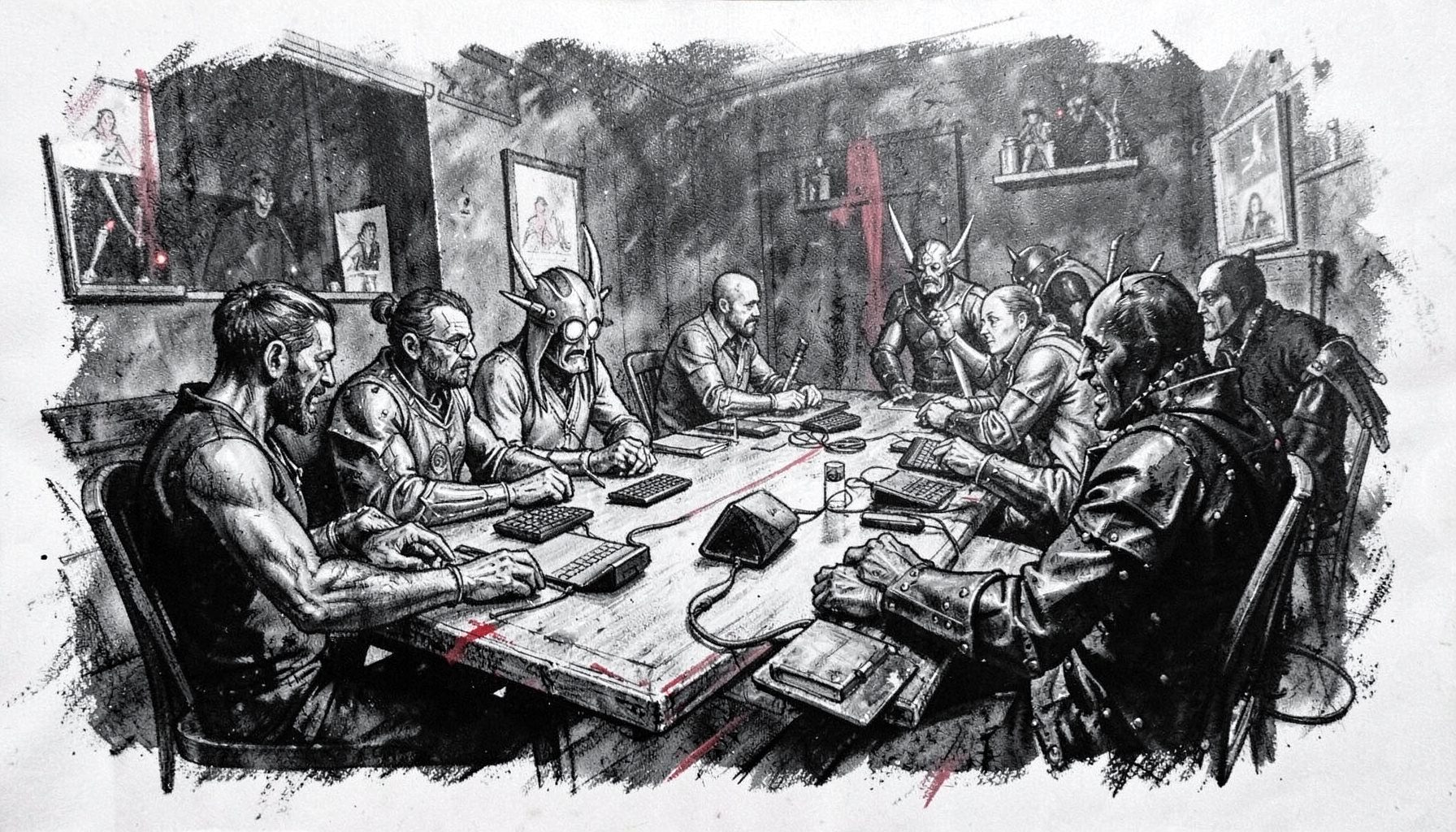
The artists behind HLGCon’s illustrated program guide
The 2018 High Level Games Convention at Atlantic City’s Showboat Hotel was designed around participation. Tabletop role-players, LARP communities, designers, publishers, artists and curious newcomers moved between games, workshops, panels, escape rooms and the exhibitor hall. The program guide had to make that varied experience feel coherent before anyone entered the venue. Learn more about Event Submission Form.
Its illustrations therefore deserve attention as part of the convention’s identity, rather than as decoration around a schedule. The artists who shaped the guide helped translate collaborative storytelling into colour, character, atmosphere and visual cues that could be understood quickly by a first-time attendee or a committed role-player planning a full weekend.
Illustration as an invitation to play
A convention program guide performs a practical job: it tells people where to go, when to arrive and what to expect. An illustrated guide performs an emotional job as well. Before a reader reaches a session description, the artwork can establish whether the event feels playful, dramatic, welcoming, mysterious or slightly theatrical.
That balance matters at a gaming convention because the audience is rarely interested in just one format. A visitor might begin with a fantasy tabletop session, attend a world-building workshop, browse independent games and then try a LARP or escape room. Illustrators had to create imagery broad enough to represent those different activities without making the convention look like a single narrow genre event.
The strongest program art usually leaves room for the viewer’s imagination. A cloak, a strange doorway, a map fragment or a group gathered around a table can suggest a complete story without explaining it. That open-ended quality mirrors role-playing itself: the artist provides a prompt, while the audience supplies the character, motive and next move.
The visual language of collaborative storytelling
Illustrators working on a guide like this are effectively building a visual vocabulary. Recurring shapes, motifs and characters can connect pages that contain very different information. A fantasy figure may signal adventure, while dice, speech bubbles or theatrical masks can distinguish tabletop play, discussion and performance without relying on long blocks of text.
Line quality also changes the mood. Loose, energetic marks can suggest improvisation and live action; carefully rendered environments can make a setting feel immersive; bold silhouettes can help readers scan a crowded page. These choices are especially useful in a printed guide, where the design must remain legible under convention conditions: fluorescent hotel lighting, hurried browsing and a reader carrying bags or food.
The artists’ contribution extends to pacing. A page crowded with panels, characters and decorative borders feels active, while a quieter illustration can give the eye a pause between dense schedule details. Good visual pacing respects the practical needs of attendees while preserving the sense that the weekend is an unfolding narrative.
Making a diverse convention feel legible
HLGCon brought together people with different levels of experience, from established gamers to people encountering tabletop RPGs or LARP for the first time. The guide’s illustrations could help reduce the intimidation that sometimes comes with a large convention. Friendly expressions, readable gestures and scenes of people cooperating communicate that participation is expected, not reserved for experts.
This is also where representation becomes a meaningful artistic responsibility. A program image can imply who belongs in the room through its bodies, clothing, ages, mobility aids, cultural references and group dynamics. Inclusive artwork does not need to turn every page into a statement. It can simply show a range of people sharing attention, solving problems and making space for one another.
The same principle applies to LARP imagery. Weapons, costumes and intense poses can look exciting, but they should sit alongside visual signals of consent, boundaries and mutual care. HLGCon’s practical discussion of LARP safety guidance is a useful companion to the artwork because it links the fantasy aesthetic with the real responsibilities of a live event.
From printed page to convention floor
A program guide has a short but important life. It may be read at home, folded into a backpack, marked with a pen and consulted repeatedly while someone crosses a hotel. This gives illustration a functional role that differs from gallery art or a poster viewed at a distance. Images must support navigation, survive reproduction and remain recognisable when printed at modest size.
The artists also had to work within the physical character of the Showboat Hotel. A convention spread across function rooms, hallways, vendor spaces and activity areas can feel confusing, particularly when multiple sessions begin close together. Strong visual hierarchy helps turn a collection of listings into a mental map. Distinctive motifs can make sections easier to remember: a particular colour family for workshops, a recurring emblem for LARP, or a character that appears near social activities.
For an Australian audience, the format is familiar from events such as PAX Aus in Melbourne, Oz Comic-Con in Sydney and smaller tabletop gatherings in Brisbane or Adelaide. Local conventions often depend on compact printed schedules, venue signage and volunteers to bridge the gap between a digital timetable and the physical site. HLGCon’s illustrated guide belongs to that same tradition of making a temporary community feel navigable.
The artist’s place in the gaming economy
Convention illustration sits within a wider creative economy that includes self-published games, small press books, commissions, posters, maps and character art. Artists often work across several of these areas, adapting a recognisable style for different budgets and audiences. A program guide can function as a portfolio piece because it demonstrates editorial judgement as well as drawing skill: the ability to communicate an event, support a brand and collaborate with organisers.
The commercial context is relevant in Australia, where the market for niche gaming art is active but comparatively small. An artist may sell at a convention in Melbourne, ship prints to Perth or work with a publisher in Sydney while managing postage, GST obligations and short print runs. Buyers tend to value practical objects—prints, zines, maps, stickers and illustrated rulebooks—that carry the atmosphere of the event into everyday spaces.
Copyright also shapes this work. Under Australia’s Copyright Act 1968, original illustrations receive protection automatically when created; an organiser’s permission to reproduce artwork in a guide does not necessarily transfer every future use. Clear agreements should cover print quantities, online publication, social media promotion, merchandise, credit lines and whether the artist may display the commission in a portfolio. Those details matter to convention artists whose work may continue circulating after the weekend ends.
Reading the guide as an artistic record
A useful way to study the program guide is to look for the decisions behind each image. Ask what the artwork tells a reader before the schedule is read: Does it promise discovery, competition, comedy, suspense or companionship? Does it show gaming as a solitary hobby, or as an activity made richer by a group? Does the visual style leave room for many genres, or push the audience towards one expected kind of story?
The guide can also be read as a record of production. Look for repeated characters, changes in scale, differences between decorative art and information-led graphics, and signs of collaboration between illustrators, editors and event organisers. Even small details—an icon beside a session type, a border that separates activities, or a character pointing towards a block of text—show how illustration and event logistics depend on one another.
For future convention organisers and artists, the following comparison captures the different jobs the artwork may need to perform:
| Artistic element | What it communicates | Practical value at a convention | Australian relevance |
|---|---|---|---|
| Character illustration | Personality, genre and invitation | Creates an emotional entry point | Helps small local events build a recognisable identity |
| Scene or environment | Place, mood and scale | Prepares attendees for immersive activities | Works well for hotel venues and multi-room festivals |
| Icons and motifs | Session type or activity | Speeds up timetable scanning | Useful in print guides and mobile-friendly schedules |
| Inclusive group portrait | Belonging and cooperation | Reduces barriers for newcomers | Reflects broad participation across local gaming communities |
| Decorative borders and maps | Continuity and navigation | Links separate guide pages | Supports crowded venues where signage must be clear |
The guide’s legacy is therefore larger than its paper format. It gave HLGCon a visual memory: a set of images that could connect a game designer’s workshop with a LARP encounter, a vendor conversation with an escape-room challenge and a first visit with a returning player’s routine. When organisers invite artists into the planning process early, the result can be both beautiful and useful. When readers slow down enough to notice those choices, the program becomes a small illustrated history of the community it served.
For artists preparing work for a similar event, the practical takeaway is simple: design every image to welcome someone in, orient them once they arrive and leave enough imaginative space for them to help create the story.